The Conan and Robert E. Howard Website |
||||
| |
|
The Conan and Robert E. Howard Website |
||||
| |
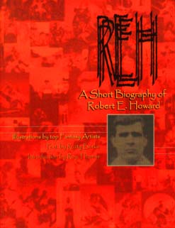
REH: A Short Biography of Robert E. Howard A Review by Leo Grin (Copyright © 2000 Leo Grin - All rights reserved)
 Due
to the boundless generosity of REHupan Jim Keegan and family, I finally
have my own copy of the Cross Plains Comics release "REH: A Short
Biography of Robert E. Howard". I have spent some time studying the
book in detail, from the text to the art to the graphical presentation.
Here are my detailed opinions, in all of their raw glory: Due
to the boundless generosity of REHupan Jim Keegan and family, I finally
have my own copy of the Cross Plains Comics release "REH: A Short
Biography of Robert E. Howard". I have spent some time studying the
book in detail, from the text to the art to the graphical presentation.
Here are my detailed opinions, in all of their raw glory:
The first thing you notice when you pick up this book is that it's ugly. The cover is a blurry collage of small, indecipherable art reproductions and Howard photos, all bathed in a saturated orange that overwhelms everything it colors. The attempts at graphical elegance on the cover seem simplistic and amateurish, even by my feeble standards. Yellow text with bad drop shadows (one text-block has the drop shadow going right, while the other is going left) with a head shot of REH colored in puke green with these generic little lines shooting off from it on each side. The result is under whelming, to say the least. What a difference from the simple yet elegant style which Keegan gave to the recent Worms of the Earth comic adoption! In WORMS, all of the little PhotoShop enhancements are done with class and with a purpose, and none detract from the main thrust of the piece. Colors match and are natural looking, and all of the drop shadows, fades, and text placement seem to be understated and serve the ultimate purpose of the look: to give the work the feel of barbarism (stone and wood textures and colors, weathered-looking fonts) while simultaneously projecting a sheen of class and elegance (a layout that controls where the eye is focused, colors that don't clash). This kind of attention to design and purpose seems to be completely absent from the SHORT BIO. The leading Introduction by Richard Ashford is rather overblown and underhanded, I think. He states "I promised myself that I would spare everyone from the overhyped press release for a book. I would be enthusiastic but honest." Then a few sentences later he calls the book "a watershed in the use of computer coloring and design in comics…a book that is too beautiful to sit on your shelf, you have to get it down and at least once a day to flick through it." I find that statement to be ridiculous (and many would call me a king of overstatement myself). One of the things that grates about the presentation of the artwork is that there are no page numbers anywhere in the book. This makes it a real chore to use the index in the back to figure out who drew what. I'm sure the designer thought that page numbers lacked "elegance", but it was ultimately stupid to leave them out altogether. VERY frustrating. In general, I found most of the art to be standard or sub-standard comics fare, and very distracting to the subject matter at hand (a bio of REH). Rafael Kayanan is a good colorer, but his efforts don't manage to save much of the art from being less than impressive. And again, I know it is supposed to be an eclectic collection from many different artists and styles, but the unifying theme of it all being related to Howard doesn't work, and the book has a very slipshod, haphazard feel as a result. It's all too distracting. There are several good pieces of art in there, most of the good ones looking more like a painting than a comic. Unfortunately, the lack of page numbers makes it a chore to link up art with artists. Would it have been too hard to credit them right under the art, in a nice small semi-transparent font? There are also several Howard pictures used throughout the book, but
unfortunately nothing there is new or groundbreaking, even though there
are several pictures of REH which are rare. I found the colorizing of
some of the photos to be excellent, especially the one of Howard as
a child in the cowboy hat, and the one of Hester Howard. The picture
of Howard drinking from the schooner has been stylized in a nice way.
But where the coloring goes right, the design goes wrong. Hester Howard's
photo is ghosted by two more, gradually getting more blurry, with no
real increase in eye-pleasing design as a result. 
Since no captions have been placed under any of the photographs, several pictures will be incomprehensible to the average person, unless they have more than a little knowledge of Howard (examples are the picture of Novalyne, or the picture of the Cleopatra statue Howard bought in New Orleans). Again, another technique that could have unified and deepened the book's immersion-level went unused, and the book suffers as a result.  Then we get to
the text itself. First off, the bad design continues with the choice of
font, font size, and art placement. The font looks too big, things are
highlighted in dull browns and grays, and much of the text has been placed
over large frames of artwork, making it difficult and distracting to read.
Likewise, the artwork is nearly completely obscured by the text, so both
of them cancel each other out, and neither is pleasant to look at. The
much smaller font size of the Roy Thomas introduction gets it right. The
page is readable, looks like it's packed with lots of text, and the artwork
surrounding it either has its own page or is tastefully bordered off to
the side, the text wrapping around its edge nicely. Then we get to
the text itself. First off, the bad design continues with the choice of
font, font size, and art placement. The font looks too big, things are
highlighted in dull browns and grays, and much of the text has been placed
over large frames of artwork, making it difficult and distracting to read.
Likewise, the artwork is nearly completely obscured by the text, so both
of them cancel each other out, and neither is pleasant to look at. The
much smaller font size of the Roy Thomas introduction gets it right. The
page is readable, looks like it's packed with lots of text, and the artwork
surrounding it either has its own page or is tastefully bordered off to
the side, the text wrapping around its edge nicely.And now Roy Thomas' Introduction. He says that the Conan depicted in Frazetta's classic CONAN THE ADVENTURER cover looks "let's face it, maybe just a bit retarded". We find out that the premier Howard adapter in the comic world has "never been wild on S&S as a genre". He also says that "..this led in turn to my morphing REH's one-shot heroine Red Sonya into Red Sonja (which left Sonya herself 100% intact, so what harm was done?)". It gets worse as he proudly lists a series of horrifying accomplishments. He helped write the movie Conan the Destroyer. He wrote scripts for the "Conan the Adventurer" Saturday Morning cartoon (which had Conan hitting lizard-people with a sword which sent them up into a wormhole and off to another dimension, in a quest to save his family who has been turned to stone by an evil lizard king). He co-produced episodes of the Conan syndicated TV show. He brags that he turned "non-Conan REH stories like 'The Slave Princess' into Conan Adventures, which in no way detracted, I think, from their original Cimmerian-less status". And of course, even in a love-fest of comic artwork, Thomas is sure to mention that Howard "was both pulp hack and a great talent" and "more than sixty years ago, REH put a bullet through his brain". Thanks for reminding us, Roy. Thomas' desire to defend himself is evident throughout his prose, as he inserts little tidbits like "with Glenn's permission" and "I should never have let him talk me into allowing him to put those stupid bumble-bee striped sleeves on Solomon" whenever he is talking about glaring, needless, stupid changes he made to Howard's stories. Here's a news flash for Mr. Thomas: anyone who, even for a moment, thought that it would be OK to put Solomon Kane in "bumble-bee striped sleeves" has NO BUSINESS doing ANYTHING with ANY of Howard's stories. But these kinds of vultures just don't get it, and they never will. They will never understand the difference between adapting a story for a medium and needlessly changing the story to give themselves the inner warmth gained by having "improved it". Ahhhhhhh….and now we get to Rusty. I was really looking forward to reading Rusty's text, because I felt it would be a small example of what his eventual biography would read like. This effort does live up to Rusty's strict standards for accuracy and fair-mindedness, and for that I was grateful. However, I think that this effort is a double-edged sword of sorts, because it attempts to satisfy two diverse groups (new fans and knowledgeable scholars), and as a result it tends to not completely satisfy either. There is much in this book that Joe-Fan wouldn't care to know (and much lacking that I think he would, such as a recommended reading list), just as there is much basic Howard information that a long-time Howard aficionado will be tired of hearing. I believe that this book needed to pick an audience and play to it. In a longer biography, Rusty will no doubt correctly assume that the work will be intended for the serious student, and phrase his prose accordingly. But the length and presentation of this book forces him to toe a line that doesn't really exist, and because of this "newbie-scholar schizophrenia" the book lacks a certain focus of purpose. I don't see it as Rusty's fault that this happened, but I think everyone involved with producing the book needed to establish very concrete goals concerning what they were going to accomplish, and any additional elements in the book should have been supportive of (not distracting from) that ultimate purpose. This book would have worked better, I think, had it focused primarily on the new Howard fan, and left out some of the little details that scholars argue over (like the conflict over the date of Howard's birth). I would have liked to see the middle section of the text divided into major chapters (using page design and art to give each chapter a different look and color design), with each chapter focusing on a character or group of Howard's stories. This is done to an extent, but far too haphazardly and confusingly for my tastes. The final goal of this book should have been to give a new fan a very clear idea of what Howard wrote, why they are such great stories, and where to find them. The tone and content of Howard's biography should have been tailored to enhance and support this goal. That's my opinion, anyway. With all of the artistic talent involved, it should have been an easy matter to produce maps of Texas and of Howard's fictional worlds to supplement the text, along with recommended reading lists and concise character and story summaries. Perhaps making this book valuable as a reference as well as a biography would have increased the intellectual value of it. As it is, far too much hoopla was given to the comic art, which, let's face it, no one really cares about. It's to Jim Keegan's eternal credit that the cover of WORMS has but one name on it…Robert E. Howard. So that's that. I think the lesson to be learned is that deep Howard discussion should not be married with comic book art. It's just not a good mix. I believe that any book about Howard needs to have the text as the penultimate focus. Any artwork or pictures need to be presented as a useful addition to the text, not as a distraction. I should add as a final caveat that I seem to be in the minority opinion regarding this book. Most everyone else in REHupa [the Robert E. Howard United Press Association] has expressed their highest regard for both the book and its contents (at least while within earshot of the book's producers). I may be the only one who disagrees, so make of my ornery yet heartfelt opinion what you will. I just had high expectations for this book, and I wasn't at all expecting the explosion of disparate elements and conflicting design styles that I found upon reading it. Now I'll go hide before anyone pulls out their knives….
|